
What are Modifier-classes?[edit source]
Modifier-classes define the SciFree style and customize it within the Turnkey Style System.
Use Turnkey or MDriven modifier classes by putting them into the style ref in the View Model Editor.
Example style for the buttons:

Downloading this CSS-file[edit source]
You can download the CSS file here (stylesheet) that contains all the style data with the latest changes.
TEXT[edit source]
You can style the text with modifier-classes like:
TEXT[edit source] | |
| Type here | tk-bold |
| Type here | tk-italic |
Type here |
tk-primary |
Type here |
tk-success |
Type here |
tk-error |
CHIPS[edit source] | |
Type here |
tk-grey-chip |
Type here |
tk-blue-chip |
Type here |
tk-green-chip |
Type here |
tk-yellow-chip |
Type here |
th-red-chip |
Chips can be used in the table to highlight different statuses or process stages. E.g.:
Pending...
BUTTONS[edit source]
There are three forms of buttons in the Turnkey Style System: default, outlined, and flat.
You can also use colors like primary (main SciFree color), danger, or success. For more colors, follow the Turnkey Style System.
Choose the needed form and color then put their modifier-classes into the style-ref. (you don't need to add 'default' styling).
E.g.: primary, primary outlined, primary flat, danger, danger flat, etc.
MODIFIER CLASSES ARE FOR BUTTONS AND LINKS ONLY. USE MD-PREFIXED CLASSES FOR STYLING TEXT- e.g. tk-primary.

SPECIAL BUTTONS[edit source]
Also, you can stack on top of modifier-classes for special buttons (adds special Material Design Icons).
You can remove the "action name" for the button and the standalone icon without text as a button.
| Example | Style reference |
|---|---|
 |
tk-upload-btn primary |
 |
tk-delete-btn primary |
 |
tk-back-btn primary |
|
tk-next-btn primary | |
|
tk-search-btn primary | |
 |
tk-remove-btn primary flat
(standalone icon without text) |
 |
tk-add-btn primary flat
(standalone icon without text) |
 |
tk-add-btn primary flat |
 |
tk-info-btn flat |
SPECIAL ICONS[edit source]
Add icons to any element (not only the buttons) by using the following classes.
 |
 |
| tk-document
tk-primary |
tk-location
tk-primary |
INFO-ELEMENTS[edit source]
Info-elements can be static or removable.
 |
 |
 |
| tk-info-text
(static text that can be added anywhere on the page, preferably take less than 6 col, tagged value: HideHeading) |
tk-info-box
(static text that can be added anywhere on the page, preferably take less than 6 col, tagged value: HideHeading) |
tk-info-banner
(special info-help for newbies, removable groupbox, that contains text and action to remove it, can be added at the top of the page, tagged value: HideHeading) |
How to create an info-banner[edit source]
Create a GroupBox of 1 row and 12 col with style-ref: tk-info-banner, add static-text of 11cols, and action tk-remove-btn of 1 col inside.

To make it removable:
- Create a Boolean variable (
vRemoveInfo, false) - Make the GroupBox visible, when
vRemoveInfois true only - Set the remove action EAL expression to
vRemoveInfo := true
TABLES[edit source]
 |
| tk-table |
Both variants can be used without a heading by adding a tagged value: HideHeading.
Choose the style of the text for each column: e.g. Main object is bold - tk-bold, or with SciFree colors - tk-primary
REPORTING STATES[edit source]
Use reporting states with icons by adding the following modifier-classes. You can choose to colour them in tk-primary/tk-success/tk-danger colour or just leave it to the default grey, without adding any additional modifier classes.
 |
 |
 |
 |
 |
| tk-uploading-state
tk-primary |
tk-processing-state
tk-primary |
tk-waiting-state
tk-primary |
tk-success-state
tk-success |
tk-error-state
tk-danger |
CARDS (wrappers for GroupBoxes)[edit source]

tk-group-card
(tagged-value: HideHeading)
LISTS[edit source]
Tables in the form of lists
 |
 |
| tk-items-list--default | tk-items-list--primary |
To make a list of affiliations like in the example:
- Use tk-document style ref to the name of the document column
- Add "remove action" with tk-remove-btn flat style ref
SEARCH with DROPDOWN OF SUGGESTIONS[edit source]

To make a search field like in the example(with an add action):
- Create a GroupBox with tk-searchbox style ref that includes search input with the
vSeekParamvariable and a table of results -vSeekerResult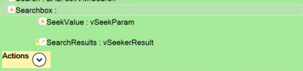
- Include the search input that takes 1 row and adds "HideHeading" and proper "Placeholder" tagged values (see also Databound Placeholder text).

- Set style ref for search input as an expression (if the vSeekParam is not empty and there are more than 0 results, then 'tk-searchbox--searching' class should be added).


if not vSeekParam.isNullOrEmpty and (Something.allInstances->size > 0) then 'tk-searchbox__input tk-searchbox--searching' else 'tk-searchbox__input' endif
- Set table of results is a nested ViewModel class that contains one or two attributes and optional action; (optional) add "add action" with tk-add-btn primary style ref to the nesting and set its expression to:
vCurrent_SearchResultGrid;/*Choose the current row in the results grid*/
vCurrent_Something.Something.add(vCurrent_SearchResultGrid); /*Main action*/
vSeekParam := String.NullValue /*Clean the search input field*/
- Set "HideHeading" tagged value
- Set style ref - "tk-searchbox__results";
- Set visible expression to results if the search field is not empty and there are more than 0 results
not vSeekParam.isNullOrEmpty and not (vSeekerResult->size <= 0)
Now, you can set a search server-side action that runs every 30ms only when the search field is not empty (DisabledExpression: vSeekParam->isEmpty )
More about server-side actions
SPECIAL FIELDS FOR DOCUMENT MANAGING[edit source]
TABS[edit source]
How to create a tabs-group with a GroupBox[edit source]
- Create a GroupBox without a heading (+ add "HideHeading" tagged value) and set style-ref to tk-tabs-group (+ add "HideHeading")
- Add a proper amount of tab-buttons (distribute the columns for buttons inside the GroupBox equally) and set every button style-ref to tk-tab-btn flat
- For the chosen tab (button) and set the state - disabled and preferred style ref e.g. tk-tab-btn primary flat (all the possible styles listed further)
- Now copy the GroupBox of buttons to every page needed. Don't forget to change the disabled state for the current tab.
 |
 |
 |
| tk-tabs-group
(every button) tk-tab-btn flat (current tab) tk-tab-btn flat |
tk-tabs-group
(every button) tk-tab-btn flat (current tab) tk-tab-btn primary (without flat) |
tk-tabs-group
(every button) tk-tab-btn flat (current tab) tk-tab-btn primary flat |
PAGE HEADERS[edit source]
Create page headers with subheaders like this:

- Create two table-columns for Page-header and its Subheader
- Choose the size of your Page Header from h1 to h5 and add it to the style ref
- Add "tk-sub-header" to the Subheader style