No edit summary |
No edit summary |
||
| Line 3: | Line 3: | ||
Quick help for when you're confused by why you're seeing when working with placing containers (flex box) | Quick help for when you're confused by why you're seeing when working with placing containers (flex box) | ||
==== Why isn't this container filling (becoming the full width of) the container above? ==== | |||
If you haven't made any special setting it's probably because a container only "fills" the container above in the perpendicular direction. If you want it to fill he whole width, for example for a table, make it's direction "Column". | If you haven't made any special setting it's probably because a container only "fills" the container above in the perpendicular direction. If you want it to fill he whole width, for example for a table, make it's direction "Column". | ||
* Direction Column => Fills horizontal and stacks vertical | * Direction Column => Fills horizontal and stacks vertical | ||
* Direction Row => Fills vertical and stacks horizontal | * Direction Row => Fills vertical and stacks horizontal | ||
==== I want to make a table and have one fixed width column and then the rest flexible width ==== | |||
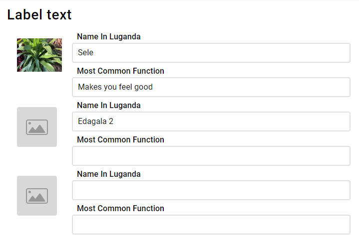
In the table the goal is to have the images in fixed size, and the right take up the rest of the page width. Important is to know that there's no way in containers/flexbox to make rows aware of each other, so the image size needs to be fixed, or at least fixed for a screen size range. Use CSS media queries to make them different depending on the screen size. | |||
[[File:Fixed left column.png|none|frame]] | |||
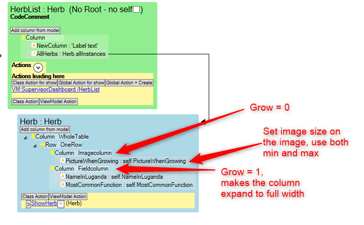
Viewmodel; | |||
[[File:Table viewmodel.png|none|frame]] | |||
The main thing to understand here is that you need to set | |||
* Imagecolumn to Grow = 0 | |||
* Fieldcolumn to Grow = 1 | |||
This makes the field column fill the remaining space horizontally. | |||
You can control how large the columns will be on the column itself using Self-align (X-direction). | |||
Revision as of 15:55, 18 November 2022
PlacingContainers are introduced in this blog article: https://blog.mdriven.net/placingcontainers-flexbox/
Quick help for when you're confused by why you're seeing when working with placing containers (flex box)
Why isn't this container filling (becoming the full width of) the container above?
If you haven't made any special setting it's probably because a container only "fills" the container above in the perpendicular direction. If you want it to fill he whole width, for example for a table, make it's direction "Column".
- Direction Column => Fills horizontal and stacks vertical
- Direction Row => Fills vertical and stacks horizontal
I want to make a table and have one fixed width column and then the rest flexible width
In the table the goal is to have the images in fixed size, and the right take up the rest of the page width. Important is to know that there's no way in containers/flexbox to make rows aware of each other, so the image size needs to be fixed, or at least fixed for a screen size range. Use CSS media queries to make them different depending on the screen size.
Viewmodel;
The main thing to understand here is that you need to set
- Imagecolumn to Grow = 0
- Fieldcolumn to Grow = 1
This makes the field column fill the remaining space horizontally.
You can control how large the columns will be on the column itself using Self-align (X-direction).


