No edit summary |
No edit summary |
||
| Line 1: | Line 1: | ||
The PlacingContainer is a way to organize a view based on the box-in-box principle, in contrast to the default way of placing components on a ViewModel in a Grid pattern with | The PlacingContainer is a way to organize a view based on the box-in-box principle, in contrast to the default way of placing components on a ViewModel in a Grid pattern with X and Y coordinates. | ||
The web browser [https://www.w3schools.com/css/css3_flexbox.asp FlexBox] has been used | The web browser [https://www.w3schools.com/css/css3_flexbox.asp FlexBox] has been used to explain most of how PlacingContainers work. | ||
When using the web renderer (for example, in TurnKey), the output from the | When using the web renderer (for example, in TurnKey), the output from the Framework will be HTML with '''Flexbox CSS''' for layout. In the Designer or a WPF application, you're using MDriven's implementation of a Flexbox renderer. | ||
PlacingContainers are introduced in this blog article: https://blog.mdriven.net/placingcontainers-flexbox/ | PlacingContainers are introduced in this blog article: https://blog.mdriven.net/placingcontainers-flexbox/ | ||
=== Notes for when you're confused by | === Notes for when you're confused by what you're seeing when working with Placing Containers (Flexbox) === | ||
==== Why isn't this container filling (becoming the same width | ==== Why isn't this container filling (becoming the same width) as the container above? ==== | ||
If you haven't made any special settings, it's probably because a container only "fills" the container above in a perpendicular direction. If you want it to fill the whole width, for example, for a table, make its direction "Column". | If you haven't made any special settings, it's probably because a container only "fills" the container above in a perpendicular direction. If you want it to fill the whole width, for example, for a table, make its direction "Column". | ||
* Direction Column => Fills horizontally and stacks vertically | * Direction Column => Fills horizontally and stacks vertically | ||
| Line 17: | Line 17: | ||
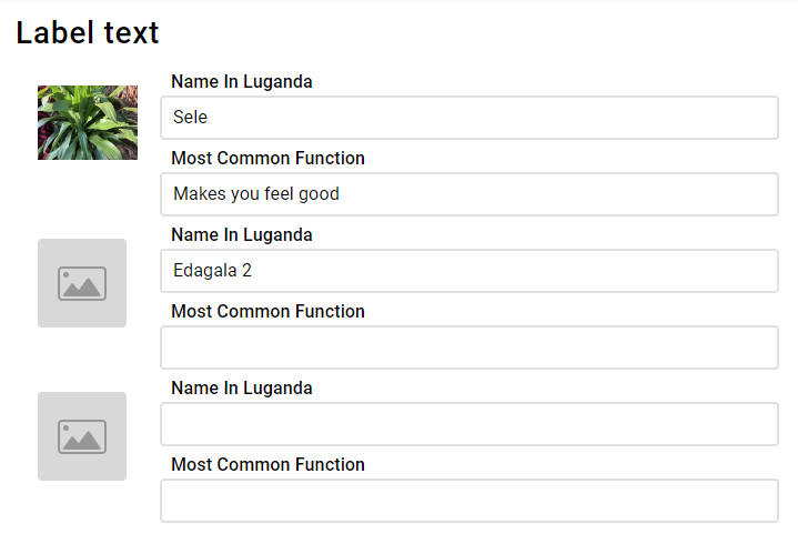
In the table, the goal is to have the images in a fixed size, and the right takes up the rest of the page width. It is important to know that there's no way in containers/flexbox to make rows aware of each other, so the image size needs to be fixed or at least, fixed for a screen size range. Use CSS media queries to make them different depending on the screen size. | In the table, the goal is to have the images in a fixed size, and the right takes up the rest of the page width. It is important to know that there's no way in containers/flexbox to make rows aware of each other, so the image size needs to be fixed or at least, fixed for a screen size range. Use CSS media queries to make them different depending on the screen size. | ||
[[File:Fixed left column.png|none|frame]] | [[File:Fixed left column.png|none|frame]] | ||
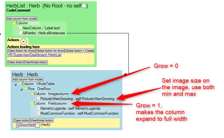
ViewModel | ViewModel: | ||
[[File:Table viewmodel.png|none|frame]] | [[File:Table viewmodel.png|none|frame]] | ||
Revision as of 07:13, 13 April 2023
The PlacingContainer is a way to organize a view based on the box-in-box principle, in contrast to the default way of placing components on a ViewModel in a Grid pattern with X and Y coordinates.
The web browser FlexBox has been used to explain most of how PlacingContainers work.
When using the web renderer (for example, in TurnKey), the output from the Framework will be HTML with Flexbox CSS for layout. In the Designer or a WPF application, you're using MDriven's implementation of a Flexbox renderer.
PlacingContainers are introduced in this blog article: https://blog.mdriven.net/placingcontainers-flexbox/
Notes for when you're confused by what you're seeing when working with Placing Containers (Flexbox)
Why isn't this container filling (becoming the same width) as the container above?
If you haven't made any special settings, it's probably because a container only "fills" the container above in a perpendicular direction. If you want it to fill the whole width, for example, for a table, make its direction "Column".
- Direction Column => Fills horizontally and stacks vertically
- Direction Row => Fills vertically and stacks horizontally
I want to make a table with one fixed-width column and the rest with a flexible width
In the table, the goal is to have the images in a fixed size, and the right takes up the rest of the page width. It is important to know that there's no way in containers/flexbox to make rows aware of each other, so the image size needs to be fixed or at least, fixed for a screen size range. Use CSS media queries to make them different depending on the screen size.
ViewModel:
The main thing to understand here is that you need to set:
- Imagecolumn to Grow = 0
- Fieldcolumn to Grow = 1
This makes the field column fill the remaining space horizontally.
You can control how large the columns will be on the column itself using Self-align (X-direction).


