This article is taking things further still – the ability to merge in your own displays in the viewmodel aided view including:
- how to mold data from your model into viewmodels using the ViewModel-designer in Modlr.
- how such viewmodels lend themselves to act as the complete definition of a view if you just dress them up with a few user interface hints (UI-Hints) – and how easy that is in the Modlr viewmodel designer.
- effective way to get an administrative UI up and running in minutes instead of hours.
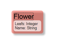
Consider this simple model:
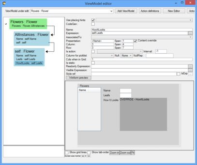
Accompanied by this viewmodel:
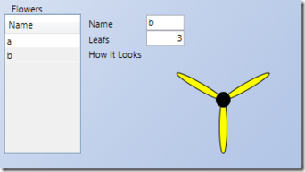
Here we display a list of all flowers by name, and a some details on the focused flower – the name and the number of leaves – but also a ViewModelColumn called “HowItLooks”.
The “HowItLooks” column has the flag Content-Override set. When this flag is set the well-behaving ViewModelUserControl should allow for the developer to inject their own display – with a callback event or the like. At this point you can associate a WPF UI control in design ti
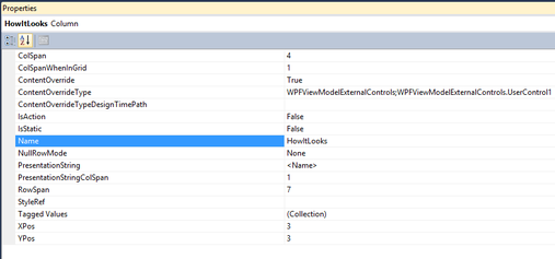
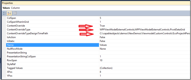
When the ViewModelColumn is selected the property inspector looks like this ☛
The ContentOverride and ContentOverrideTypeDesignTimePath are shown whenever the ContentOverride is true.
The ContentOverride expects the Assembly without the dll extension, a semi colon , and the namespace and type of the UserControl you want to display here. <AssemblynamewithoutDLLExtension>;<NameSpace>.<TypeOfExternalUIControl>.
The type you want to use must implement this interface:
namespace Eco.ViewModel.Runtime
{
   public interface IExternalWECPOFUIComponent
   {
   // Summary:
   //     Go like this: (vmc.SpawnedComponents["control"] as Grid).Children.Add(this);
   void InstallYourSelf(ViewModelColumn vmc, bool isDesignTime);
   string TheRequirementsToShowDeveloperInDesignTime();
    }
}
A simple sample
In WPF it is fairly simple to draw something that looks like a flower:
void DrawingArea_LayoutUpdated(object sender, EventArgs e)
{
   if (NumberOfLeafs != _drawnleaves)
{
    DrawingArea.Children.Clear();
    Point center = new Point(DrawingArea.ActualWidth / 2, DrawingArea.ActualHeight / 2);
    double leafdeg = 0;    for (int i = 0; i < NumberOfLeafs; i++)
 {
       Ellipse oneleaf = new Ellipse();
       oneleaf.Width = 10;
       oneleaf.Height = center.Y;
       oneleaf.RenderTransform = new RotateTransform(leafdeg, 5, 0);
       oneleaf.Stroke = new SolidColorBrush(Colors.Black);
       oneleaf.Fill = new SolidColorBrush(Colors.Yellow);
       Canvas.SetLeft(oneleaf, center.X-5);
       Canvas.SetTop(oneleaf, center.Y);
       DrawingArea.Children.Add(oneleaf);

       leafdeg = (i+1)* 360 / NumberOfLeafs;
      }
     Ellipse pistills=new Ellipse() { Width = 20, Height = 20, Fill = new SolidColorBrush(Colors.Black) };
     DrawingArea.Children.Add(pistills);
     Canvas.SetLeft(pistills, center.X-10);
     Canvas.SetTop(pistills, center.Y-10);
     _drawnleaves = NumberOfLeafs;
    }
}
The code above draws the flower simulation based on a the value in a NumberOfLeafs property.
We want to be able to bind this property to a datasource – in WPF that implies a DependencyProperty:
public int NumberOfLeafs
{
   get { return (int)GetValue(NumberOfLeafsProperty); }
   set { SetValue(NumberOfLeafsProperty, value); }
}
   // Using a DependencyProperty as the backing store for NumberOfLeafs.  This enables animation, styling, binding, etc...
   public static readonly DependencyProperty NumberOfLeafsProperty =
       DependencyProperty.Register("NumberOfLeaf", typeof(int), typeof(UserControl1), new UIPropertyMetadata(NumberOfLeafsChanged));

private static void NumberOfLeafsChanged(DependencyObject source, DependencyPropertyChangedEventArgs e)
{
   (source as UserControl1).DrawingArea.InvalidateVisual();
}
The code above handles all the details of how to turn data into display. But we want to bind our data from the viewmodel to the properties of this custom control. This is where the IExternalWECPOFUIComponent comes in. Keep in mind – we do not want our flower simulation to need to know too much – or rather anything – about our model. After all – the flower simulation might be useful in many other places in this model – and also in many other models we will create in the future. If your flower simulation saves someone else some time consider to license the rights to use your logic for money.
This is what we need to do to make our flower simulation work in a viewmodel ui:
public void InstallYourSelf(Eco.ViewModel.Runtime.ViewModelColumn vmc,bool designTime)
{
   // add yourself to the viewmodel spawnedartifacts
       (vmc.SpawnedArtifacts["control"] as Grid).Children.Add(this);
   // I want the background transparent
       (vmc.SpawnedArtifacts["control"] as Grid).Background = null;
   // Bind ViewModelColumn to the NumberOfLeafsProperty  this.SetBinding(NumberOfLeafsProperty,
   new Binding(vmc.Name) { Source = vmc.OwningDisplayClass.BindingSource });
}


public string TheRequirementsToShowDeveloperInDesignTime()
{
   // Explain in text what your control assumes about the data
return "This control needs the column to be of type int";
}
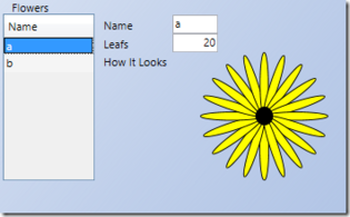
Done – let us run;
Following the changes of the data – the flower simulation is updated.
A slightly more complex sample
We have reviewed how just a single property could be visualized. Now, rare several properties and even data structure like lists and nestings.
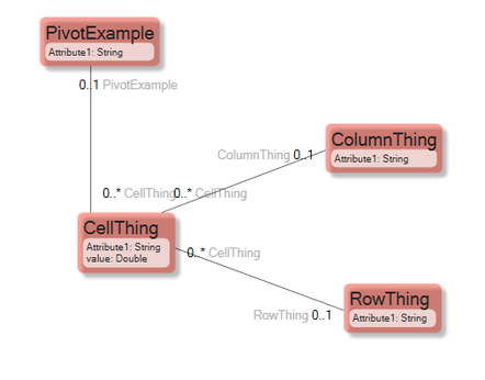
Consider a case where you have data in both directions in a grid – this is typically called a pivot. A pivot can be used in many scenarios – dates in x axis, parts in y axis and price in the cells. I am sure you can think of multiple usages for such a component. This sample is driven from a real life case where we needed a good way to edit data like this. Normal viewmodel ui grids have the column decided in design time – and only the rows made up of data.
It might not look like much – but it covers all the complexity of a pivot. A list of values (CellThing) that are mapped onto a grid of ColumnThings and RowThings. Can we display and edit this successfully we can edit and display any and all pivot needs.
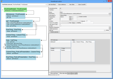
Creating a viewmodel with UI hints for the maintaince of this data could look like this:
It is handling 4 axis of information “PivotExample”, “ColumnThing”,”RowThing” and “CellThings” – it further allow for inplace comboboxes to be used for associating the Cellthings to one ColumnThing and one RowThing. \
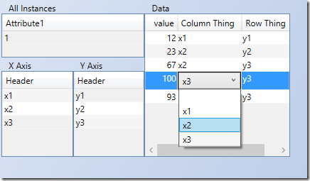
Run it and add some data:
Now when we have this simple UI to populate the data I would like to use a pivot view to see the data values plotted in a grid of row and column things:
- add ViewModelColumn and set Content-Override to true
- fill in the control we want to use
- let Modlr know the path to the assembly so that Modlr can show the component already in design time:
When Modlr can load the control in design time – it renders it and will display hints about usage when you point at it:
Remember the TheRequirementsToShowDeveloperInDesignTime method of the IExternalWECPOFUIComponent interface:
public string TheRequirementsToShowDeveloperInDesignTime()
{
  return   "<ViewModelClass>  \r\n"+  "  XAxis   -> nesting to <ViewModelClass> Header\r\n"+  "  YAxis   -> nesting to <ViewModelClass> Header\r\n"+  "  Values (THIS IS THE COLUMN THAT HAS UIOverride)  -> nesting to <ViewModelClass> X:string,Y:string,Value\r\n"+  "\r\n"+  "Follow the pattern above to present data in pivot table"; }

