Getting Started
The MDriven Turnkey Style system is based on the BEM methodology. BEM stands for Block, Element, Modifier and is a convention on how to structure CSS rules. Read more here.
Out of the box, you will receive the following UI elements:
- Static text
- Image
- Text field
- Checkbox
- Select (Combobox)
- Date picker
- Data-table
- Button
- File upload
- Link
- Textarea
- Number field
- Float field
Layout
MDriven Turnkey uses the CSS Grid to create the application layout - unless you make use of placingcontainers - then the CSS flexbox is the core layout creator.
What are Modifier-classes?
Modifier-classes allow you to customise MDriven Turnkey's components.
To use modifier-classes, put them into the "Style ref" field in the ViewModel Editor.
Text Elements
Context Colors
From the box, you're able to use five default contextual colours in MDriven Turnkey. You can modify them with the help of CSS custom properties.
- Danger
- Warning
- Success
- Info
Chip
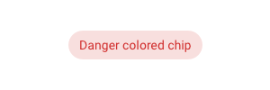
With the help of the modifier-classes, you can style your static text as a chip component from Google Material design.
| Example | Modifier-class |
|---|---|

|
chip |
|
chip danger |

|
chip warning |

|
chip success |

|
chip info |
Info Block
Coming soon...
Input Controls
Helper Text
Helper text conveys additional guidance about the input control, such as how it will be used. Helper text will only take up a single line below the input control and will be persistently visible.
To add Helper text to input control, create <ViewModelColumn>_HelperText column in the ViewModel editor, where <ViewModelColumn> is the name of the column with input.
Placeholder
Placeholder text appears in the input control when it has no value set. Placeholder can be a tip for users on how to fill up this input control.
To add Placeholder to input control, create <ViewModelColumn>_Placeholder column in the ViewModel editor, where <ViewModelColumn> is the name of the column with input.
Input controls are rendered differently depending on the value type.
Please check out Databound Placeholder text for more information.
Text Types
For inputs intended as type text, this type can be overridden with something else. Use the tagged value texttype on the column in the ViewModel.
- Password
- Tel
- URL
- Search
The type of browser used determines how these input types are rendered.
For further reference, look at https://developer.mozilla.org/en-US/docs/Web/HTML/Element/input/password
Inputs with Icon
You can add an icon to the input control to improve the visual presentation or give users the visual indicator of which type of input control it is.
To add an icon to the input control, set TaggedValue "Icon" on ViewModelColumn. The value of TaggedValue should be the icon name (MDriven Turnkey uses Material Icons – you can find these icon names on the Google fonts website).
It is possible to choose an icon position in the input control. By default, the icon will be placed at the start of the input control (leading icon). You can change this position by setting TaggedValue "IconPosition" to "after'.
Buttons
Data-bind Action's Presentation Name
Add <ActionColumn>_Presentation column in ViewModel to be able to dynamically change a presentation text of action.
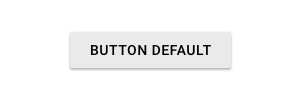
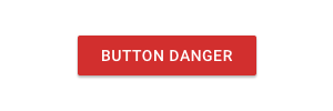
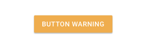
Default Buttons
| Example | Modifier-class |
|---|---|
|
|
|
danger |
|
warning |
|
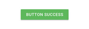
success |
|
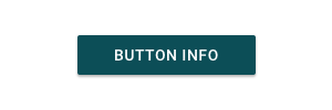
info |
Outlined Buttons
| Example | Modifier-class |
|---|---|
|
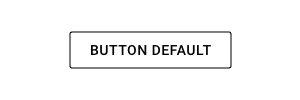
outlined |
|
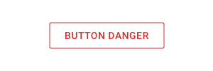
outlined danger |
|
outlined warning |
|
outlined success |
|
outlined info |
Text Buttons
| Example | Modifier-class |
|---|---|
|
flat |
|
flat danger |

|
flat warning |

|
flat success |

|
flat info |
Shaped Buttons
| Example | Modifier-class |
|---|---|
|
shaped |
|
shaped danger |
|
shaped warning |
|
shaped success |
|
shaped info |
Buttons With Icons
You can add an icon to your button. To do that, add the Tagged Value "Icon" to your ViewModelColumn which contains action. The value of the Tagged Value should be the icon name. We use Material Design icons as the default icons for the MDriven Turnkey application. Find the different icons on the following website: Icons - Material Design.
Go to Icons – Material Design and choose the icon you want to add to your button.
After you've chosen the icon you want to add to your button, click on the left bottom corner to expand the icon description. There you will be able to copy the name of the icon to the value of Tagged Value.
NOTE: If the name is "Arrow back", you must probably use "arrow_back" - the MaterialDesign icon web page is not very clear on what name to use but the space is replaced with an underscore and no capitals in the names!
Also, you can choose the position of the icon with the help of TaggedValue – "IconPosition". (There are two available options: before or after. By default – before).
Checkbox and Switch
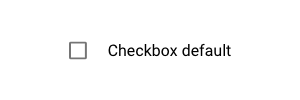
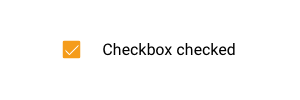
Checkbox is the default presentation of the boolean attribute in your model.
| Example | Description |
|---|---|
|
Default checkbox presentation |
|
Checkbox checked presentation |
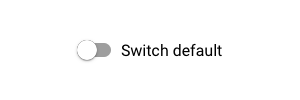
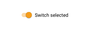
Switch is a different way in which you can present your boolean attribute in MDriven Turnkey. To change the presentation of the boolean attribute from the default checkbox to switch, set the TaggedValue "Switch" to your ViewModelColumn.
| Example | Description |
|---|---|
|
Default switch presentation |
|
Switch selected presentation |
Groupbox
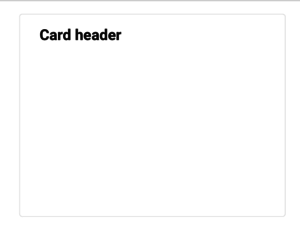
You can style the groupbox on your page as a material design card. Add the modifier-class "card" in Style ref to the ViewModelColumn with groupbox.
| Example | Modifier-class | Description | Tagged value |
|---|---|---|---|
|
card | Groupbox styled as material design card. | - |

|
- | Groupbox without header styled as material design card. | HideHeading = True |
Typography
With the help of the modifier-classes, you can style the text data in your Turnkey application as headings. The available modifier-classes are listed in the table below.
| Example | Modifier-class |
|---|---|

|
h1 |

|
h2 |

|
h3 |

|
h4 |

|
h5 |

|
h6 |
DataIsLink
In the MDriven Turnkey, you can represent your data string as a hyperlink. To make it, you should set TaggedValue "DataIsLink" on your ViewModelColumn with the data you want to present in the Turnkey as a hyperlink. The text of the link will be the ViewModelColumn's name.
If you want to change the text of the hyperlink or set it dynamically, you need to add another ViewModelColumn into your ViewModel and name it as <NameOfColumnWithHyperlink>_LinkText.


